Mammalian Heart Rates
How many heart beats do we get?
This database is being compiled by Clint Penick, Rob Dunn, and colleagues (and the public, too) as part of a research project you can learn more about on The Public Science Lab’s website: http://robdunnlab.com/projects/beats-per-life/
library(tidyverse)
library(plotly)
The source data is available from a Google Sheets document that we can download and import into R for visualization using plotly:
# Import data
hearts <- read.csv("/Users/james/Desktop/R/mammal-heart-rates/Mammal Heart Rates - Sheet1.csv")

# Plot the scaling figure
  ggplot(hearts, aes(x=log10(Resting_heartrate), y=Max_Longevity)) +
  geom_point(size=1, alpha=0.5, col="black") +
  theme_bw()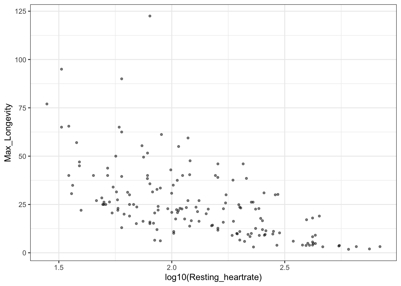
# One billion beats
x <- seq(20, 1000, 1) # beats per minute
x.2 <- x*60*24*365 # beats per year
y <- 1000000000/x.2 # years
lifespan <- data.frame(x=x, y=y)

# Plot the scaling figure with the curve representing One Billion heart beats in a lifetime

  ggplot(hearts, aes(x=log10(Resting_heartrate), y=Max_Longevity)) +
  geom_path(data=lifespan, aes(log10(x), y), size=3, color="red", alpha=0.25) +
  geom_point(size=2, alpha=0.5, col="black") +
  xlab("Log Resting Heartrate (beats per minute)") +
  ylab("Max Longevity (years)") +
  theme_bw()
## Warning: Using `size` aesthetic for lines was deprecated in ggplot2 3.4.0.
## ℹ Please use `linewidth` instead.
## This warning is displayed once every 8 hours.
## Call `lifecycle::last_lifecycle_warnings()` to see where this warning was
## generated.
# Make a column with identifying information
hearts$text.label <- paste("Common name: ", hearts$Common_name, "\n", "Mass (g): ", hearts$AdultBodyMass_g, "\n", "Heartrate (bpm): ", hearts$Resting_heartrate, "\n", "Max Longevity: ", hearts$Max_Longevity, sep="")


p <- ggplot(hearts, aes(x=log10(Resting_heartrate), y=Max_Longevity)) +
  geom_path(data=lifespan, aes(log10(x), y), size=3, color="red", alpha=0.25) +
  geom_point(size=2, alpha=0.5, col="black", aes(text=text.label)) +
  xlab("Log Resting Heartrate (beats per minute)") +
  ylab("Max Longevity (years)") +
  labs(title=" ", subtitle=" ")
## Warning in geom_point(size = 2, alpha = 0.5, col = "black", aes(text =
## text.label)): Ignoring unknown aesthetics: text

# Needed to tweak how it plots the title/subtitle
ggplotly(p) %>%
  layout(title = list(text = paste0('Beats per life',
    '<br>',
    '<sup>',
    'Data from: http://robdunnlab.com/projects/beats-per-life/',
    '</sup>')))
# q <- ggplotly(p, tooltip="text") %>%
#  layout(title = list(text = paste0('Beats per life',
#    '<br>',
#    '<sup>',
#    'Data from: http://robdunnlab.com/projects/beats-per-life/',
#    '</sup>')))

# Sys.setenv("plotly_username"="")
# Sys.setenv("plotly_api_key"="")

#Save to online file
# api_create(q, filename = "Heartrates and Lifespan")
The plotly above is also available here:
Thanks to Clint Penick and Rob Dunn for sharing the data. Help them by contributing more here: