Thermolimit respirometry analysis steps
Thermolimit respirometry analysis steps
This page is designed to be a guide for members of our lab doing thermolimit respirometry. We have a protocol (see document on our lab Google Drive) for conducting the experiment and this is meant to help complete the analysis. So I’m assuming you’ve exported a drift-corrected .csv file from the main Expedata recording. We’ll get started by importing this file. Adjust the code below for the file name and path on your device.
# Open library
library(tidyverse)
## ── Attaching packages ─────────────────────────────────────── tidyverse 1.3.0 ──
## ✓ ggplot2 3.3.3 ✓ purrr 0.3.4
## ✓ tibble 3.0.6 ✓ dplyr 1.0.4
## ✓ tidyr 1.1.2 ✓ stringr 1.4.0
## ✓ readr 1.4.0 ✓ forcats 0.5.1
## ── Conflicts ────────────────────────────────────────── tidyverse_conflicts() ──
## x dplyr::filter() masks stats::filter()
## x dplyr::lag() masks stats::lag()
# Import data file
exp.data <- read.csv("/Users/james/Desktop/R/thermolimit-analysis/Data_04-21-2021_001-leigh.csv")
file.name <- "Data_04-21-2021_001-leigh.csv"
species.info <- "Drosophila pseudoobscura"
# Use markers to identify when the recording was paused (before/after baselining)
pause.times <- exp.data$Seconds[exp.data$Marker == 112] #112 is ASCII for "p"
# Plot the CO2 trace
ggplot(exp.data, aes(x=Seconds/60, y=CO2_Li7k)) +
geom_vline(xintercept=pause.times/60) +
geom_rect(aes(ymin=-Inf, ymax=Inf, xmin=-Inf, xmax=pause.times[1]/60), fill="grey95", alpha=0.1) +
geom_rect(aes(ymin=-Inf, ymax=Inf, xmin=pause.times[2]/60, xmax=Inf), fill="grey95", alpha=0.1) +
geom_path(size=0.5) +
labs(title="Thermolimit respirometry", subtitle=species.info, caption=file.name) +
ylab(bquote(~CO[2]~'concentration (ppm)')) +
xlab("Time (min)") +
theme_bw()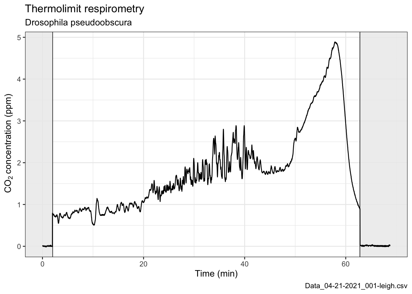 Since we’re doing thermolimit respirometry and ramping the temperature, we should take a look at that too…
# This next line pivots or converts the wide-format dataframe into a long-format data frame
exp.data.long <- pivot_longer(exp.data, -c(Seconds, Fb_Flow, Marker, Fb_O2, Fb_CO2, Activity))

# This plot will have two facets, one for CO2 and another for temperature
# Note some creative labeling to label the facets correctly
ggplot(exp.data.long, aes(x=Seconds/60, y=value)) +
  theme_bw() +
  geom_vline(xintercept=pause.times/60) +
  geom_rect(aes(ymin=-Inf, ymax=Inf, xmin=-Inf, xmax=pause.times[1]/60), fill="grey95", alpha=0.1) +
  geom_rect(aes(ymin=-Inf, ymax=Inf, xmin=pause.times[2]/60, xmax=Inf), fill="grey95", alpha=0.1) +
  geom_path(size=0.5) +
  ylab(NULL) +
  facet_wrap(~name, nrow=2, scales="free_y", strip.position="left", labeller =  as_labeller(c(CO2_Li7k = "CO2 (ppm)", Deg_C = "Temperature (C)") ) )  +
  theme(strip.background = element_blank(), strip.placement = "outside") +
  labs(title="Thermolimit respirometry (plot #2)", subtitle=species.info, caption=file.name) +
xlab("Time (min)") 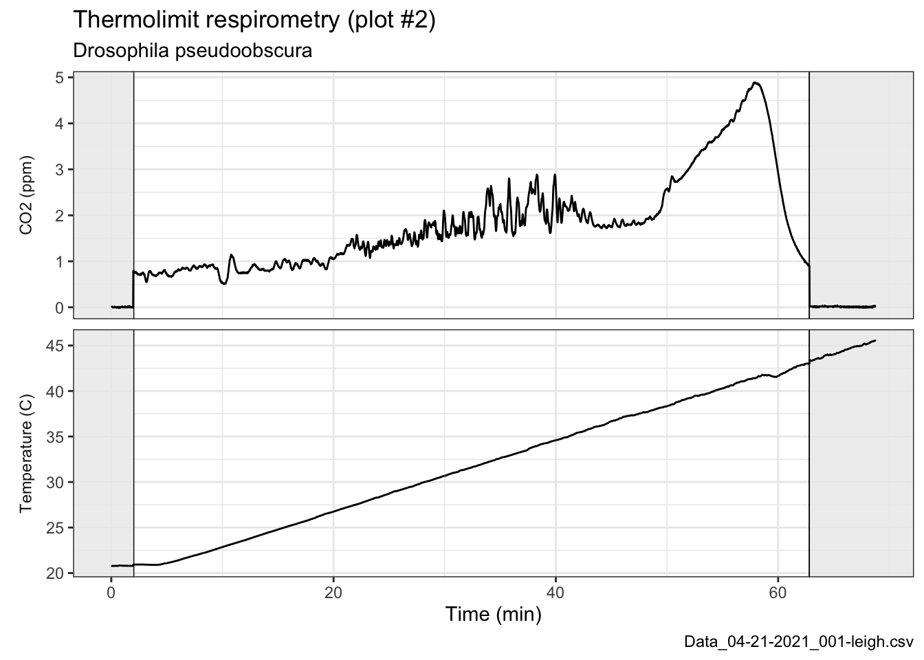
The question we’re trying to answer is what the upper thermal limit is for this fly, so we need to estimate at what time the fly died.
Behavioraly, we watched on the video recording and noted that it moved its body for the last time after 48 minutes and that the last twitch occurred about 50 minutes into the ramp protocol. During these two minutes, the temperature was changing by a full degree, so slightly better precision would be nice.
Objective CTmax estimate
Following Lighton & Turner 2004…
# Calculating and plotting the absolute difference sum (ADS) of the CO2 trace
ads.co2 <- cumsum(abs(diff(exp.data$CO2_Li7k)))
ctmax <- data.frame(ads.co2=ads.co2, Seconds = 1:length(ads.co2))
ggplot(ctmax, aes(x=Seconds/60, y=ads.co2)) +
  geom_path() +
  ylab("ADS of the CO2 trace") +
  xlab("Time (min)") +
  theme_bw()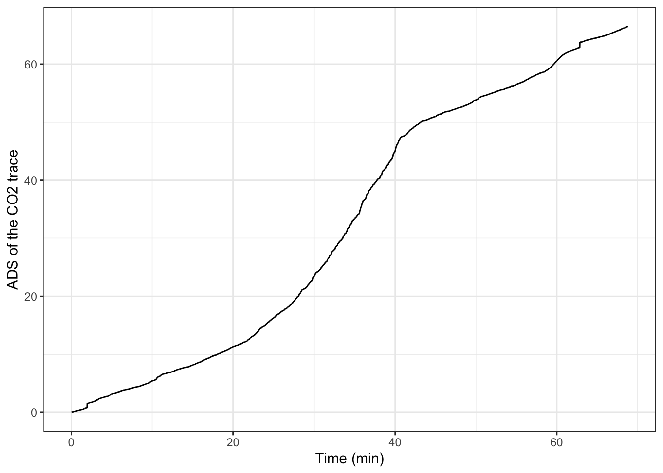
# Fitting a linear regression to the ADS, extracting the residuals, and plotting
m1 <- lm(ads.co2 ~ Seconds, data=ctmax)
r.df <- data.frame(residuals = m1$residuals, Seconds=1:length(m1$residuals))
ggplot(r.df, aes(x=Seconds/60, y=residuals)) +
  geom_path() +
  ylab("Residuals of CO2 ADS fit") +
  xlab("Time (min)") +
  theme_bw()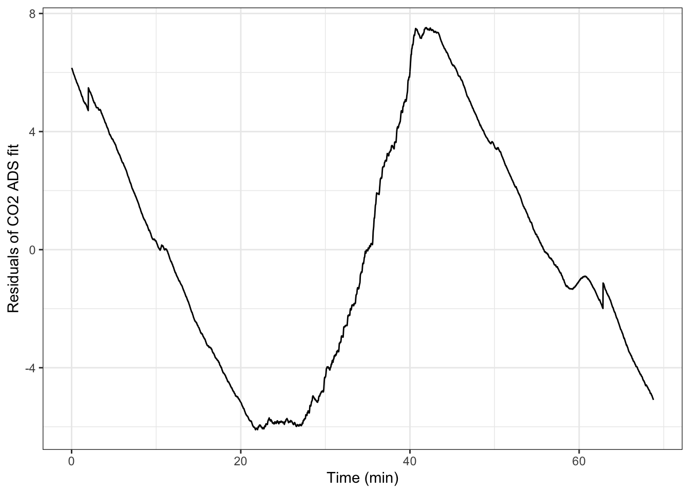
# Calculating the peak residual
max.resid <- max(r.df$residuals)

# When did this peak occur?
max.resid.time <- r.df$Seconds[r.df$residuals == max.resid]
max.resid.time/60 #minutes
## [1] 41.91667

# What temperature was it at that moment?
exp.data$Deg_C[max.resid.time]
## [1] 35.402
According to this method, the CTmax of this fly was 35.4 C. Let’s take a look at how this compares with the visual method looking at the fly’s behavior.
# We noticed the last movements between 48-50 minutes
visual.times <- c(48, 50)

# Actually these times are only after the first baselining period,
# so correcting for that (~2 minute) time offset
visual.times <- visual.times + (pause.times[1]/60)

# This is what the automated method calculated
ADS.time <- max.resid.time/60
ct.max <- exp.data$Deg_C[exp.data$Seconds == max.resid.time]

# Need a dummy data frame to get a horizontal line in only the temperature facet below
df.1 <- data.frame(name="Deg_C", value=ct.max)

# This plot will have two facets, one for CO2 and another for temperature
# Adding a yellow bar for the visual time
# Adding a red line for the ADS method time
# Adding a red dashed line for the ADS CT-max
ggplot(exp.data.long, aes(x=Seconds/60, y=value)) +
  theme_bw() +
  geom_vline(xintercept=pause.times/60) +
  geom_rect(aes(ymin=-Inf, ymax=Inf, xmin=-Inf, xmax=pause.times[1]/60), fill="grey95", alpha=0.1) +
  geom_rect(aes(ymin=-Inf, ymax=Inf, xmin=pause.times[2]/60, xmax=Inf), fill="grey95", alpha=0.1) +
  geom_rect(aes(ymin=-Inf, ymax=Inf, xmin=visual.times[1], xmax=visual.times[2]), fill="yellow", alpha=0.25) +
  geom_vline(xintercept=ADS.time, col="red") +
  geom_hline(data=df.1, aes(yintercept=value), col="red", lty=2) +
  geom_path(size=0.5) +
  ylab(NULL) +
  facet_wrap(~name, nrow=2, scales="free_y", strip.position="left", labeller =  as_labeller(c(CO2_Li7k = "CO2 (ppm)", Deg_C = "Temperature (C)") ) )  +
  theme(strip.background = element_blank(), strip.placement = "outside") +
  labs(title="Thermolimit respirometry (plot #3)", subtitle=species.info, caption=file.name) +
xlab("Time (min)") 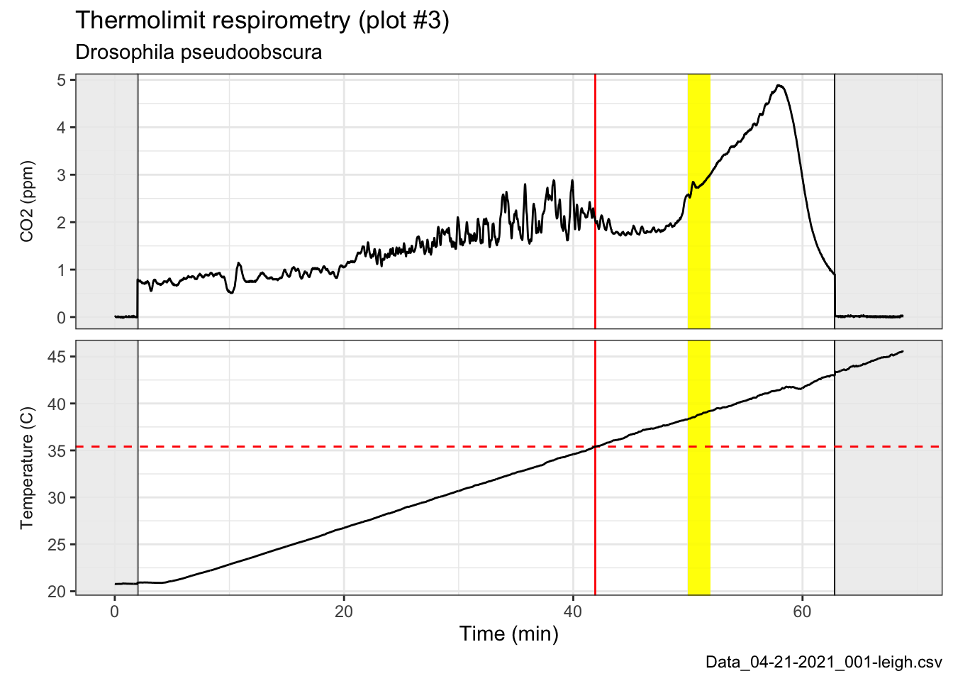
This was a surprise! In the last few runs we’ve done, the visual inspection matched relatively well with the automated method’s calculation, but in this case, the visual inspection time of death (yellow highlighted area) was ten minutes and five degrees higher than the automated calculation’s time and temperature of death (red line). Will be curious to go back to the video and see what was happening around the 40-42 minute timecode.