Interactive ggplot allometry with plotly in R
Insect metabolic allometry data
In a paper published in 2007, Steven Chown and colleagues compiled a large database of insect metabolic rates. The data demonstrated that insect metabolic rates scale hypometrically with their mass (larger insects have higher metabolic rates than smaller insects, but not proportionally as high; on a mass-specific or gram for gram larger insects are using a lot less energy than their smaller counterparts, both within and across species). The paper went on to make additional claims about how these data match up (or don’t) with the assumptions of metabolic ecology models/theories, but right now I just want to be able to look at the data!
Chown, S.L., Marais, E., Terblanche, J.S., Klok, C.J., Lighton, J.R.B. and Blackburn, T.M., 2007. Scaling of insect metabolic rate is inconsistent with the nutrient supply network model. Functional Ecology, 21(2), pp.282-290. https://besjournals.onlinelibrary.wiley.com/doi/10.1111/j.1365-2435.2007.01245.x
library(tidyverse)
library(ggExtra)
library(RColorBrewer)
library(plotly)
Let’s have a look at the data. In these figures, is is common in metabolic allometries, since masses are so unevenly distributed across the diversity of life (see the marginal histograms below), it is hard to see most of the data when they are plotted on the raw original scales.
# Import data
# For source see the published paper's supplement available online
# Note that this had to be scrubbed for inserted spacebar characters
chown <- read.csv("~/Desktop/R/plotly metrates/Chown_DB.csv")

# Scaling figure with linear regression and marginal histograms
p <- ggplot(chown, aes(x=Mass.mg, y=Metrate.microW)) + geom_point(size=1, alpha=0.5, col="black") +  theme_bw()
ggMarginal(p, type="histogram")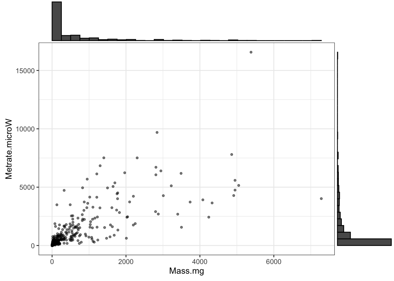
Figure 1: Insect metabolic rates vs. mass; note the extremely skewed data distributions on both axes
Although there are reasons to be cautious about doing this, metabolic allometry data are often log transformed, both for visualization and analysis. This has the advantages of being able to “see” more of the data and also the convenient property that the slope of the OLS regression line (y=b*x + c) fit to data on double log-transformed axes… is numerically the same as the slope that would otherwise be estimated by fitting a nonlinear power law (y = ax^b) on the original (i.e. not log transformed) data.
# Scaling figure with linear regression
ggplot(chown, aes(x=log10(Mass.mg), y=log10(Metrate.microW))) + geom_point(size=1) +
  stat_smooth(method="lm", se=F, col="black") +
  theme_bw()
## `geom_smooth()` using formula 'y ~ x'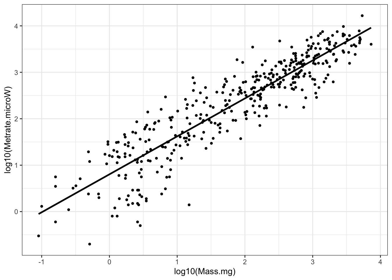
Figure 2: Insect metabolic allometry, the same data as the previous figure, but with log transforms on both axes
Having a brief look at the statistics, we can see that the metabolic rates scale with mass to the 0.8 power and that the 95% confidence interval for that exponent (or slope) is 0.78-0.86:
# OLS linear regression of the log-transformed data
m1 <- lm(log10(Metrate.microW) ~ log10(Mass.mg), data=chown)

summary(m1)
##
## Call:
## lm(formula = log10(Metrate.microW) ~ log10(Mass.mg), data = chown)
##
## Residuals:
##      Min       1Q   Median       3Q      Max
## -1.61850 -0.23942  0.03026  0.28093  1.07304
##
## Coefficients:
##                Estimate Std. Error t value Pr(>|t|)
## (Intercept)     0.80340    0.04141   19.40   <2e-16 ***
## log10(Mass.mg)  0.81731    0.01920   42.56   <2e-16 ***
## ---
## Signif. codes:  0 '***' 0.001 '**' 0.01 '*' 0.05 '.' 0.1 ' ' 1
##
## Residual standard error: 0.433 on 389 degrees of freedom
## Multiple R-squared:  0.8232, Adjusted R-squared:  0.8227
## F-statistic:  1811 on 1 and 389 DF,  p-value: < 2.2e-16

confint(m1)
##                    2.5 %    97.5 %
## (Intercept)    0.7219752 0.8848209
## log10(Mass.mg) 0.7795492 0.8550658
Visualizing metabolic allometry with ggplot2
The previous graph was fine, but there are a few more dimensions to the data we could highlight, e.g. looking at variation by taxonomic classification like insect orders.
Coming up with a useful color palette for the insect orders:
# Creating a discrete color palette for the insect orders
colourCount <- length(unique(chown$Order))
pal.1 <- colorRampPalette(brewer.pal(9, "Set1"))(colourCount)
Making a few different visualizations of the data:
# Scaling figure with orders color-coded
ggplot(chown, aes(x=log10(Mass.mg), y=log10(Metrate.microW))) +
  geom_point(aes(col=Order), size=1) +
  scale_color_manual(values=pal.1) +
  stat_smooth(method="lm", se=F, col="red") +
  theme_bw()
## `geom_smooth()` using formula 'y ~ x'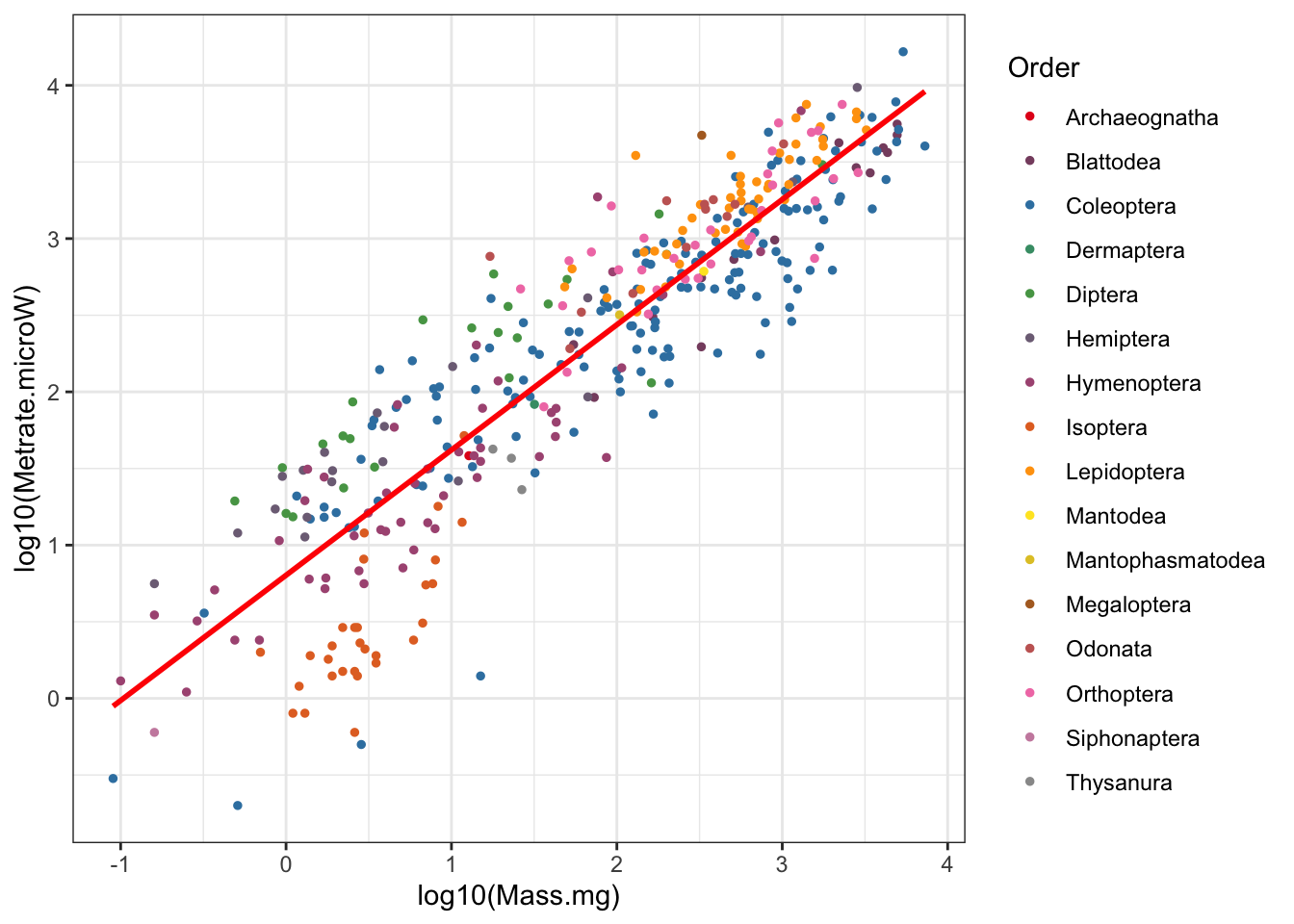
Figure 3: Insect metabolic allometry color coded by Order
# Scaling figure with regressions by order
ggplot(chown, aes(x=log10(Mass.mg), y=log10(Metrate.microW), col=Order, group=Order)) +
  stat_smooth(method="lm", se=F) +
  geom_point(size=1) +
  scale_color_manual(values=pal.1) +
  theme_bw()
## `geom_smooth()` using formula 'y ~ x'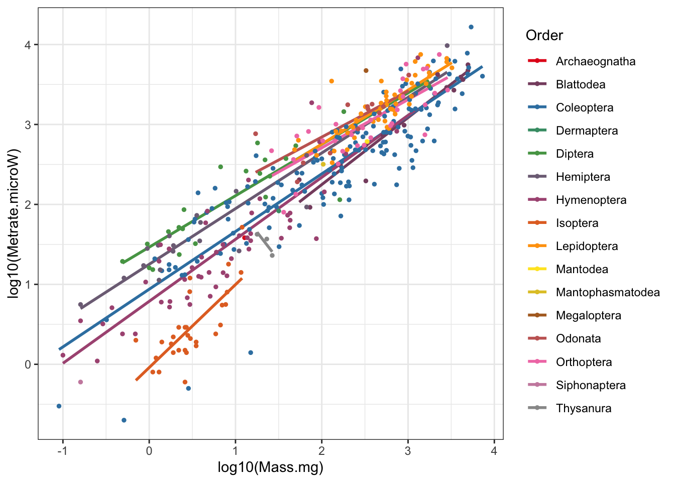
Figure 4: Insect metabolic allometry with regressions by Order
# Scaling figure faceted by order
ggplot(chown, aes(x=log10(Mass.mg), y=log10(Metrate.microW), col=Order)) +
  stat_smooth(method="lm", se=F, col="black") +
  geom_point(size=1, alpha=0.5) +
  scale_color_manual(values=pal.1) +
  facet_wrap(~Order) +
  theme_bw()
## `geom_smooth()` using formula 'y ~ x'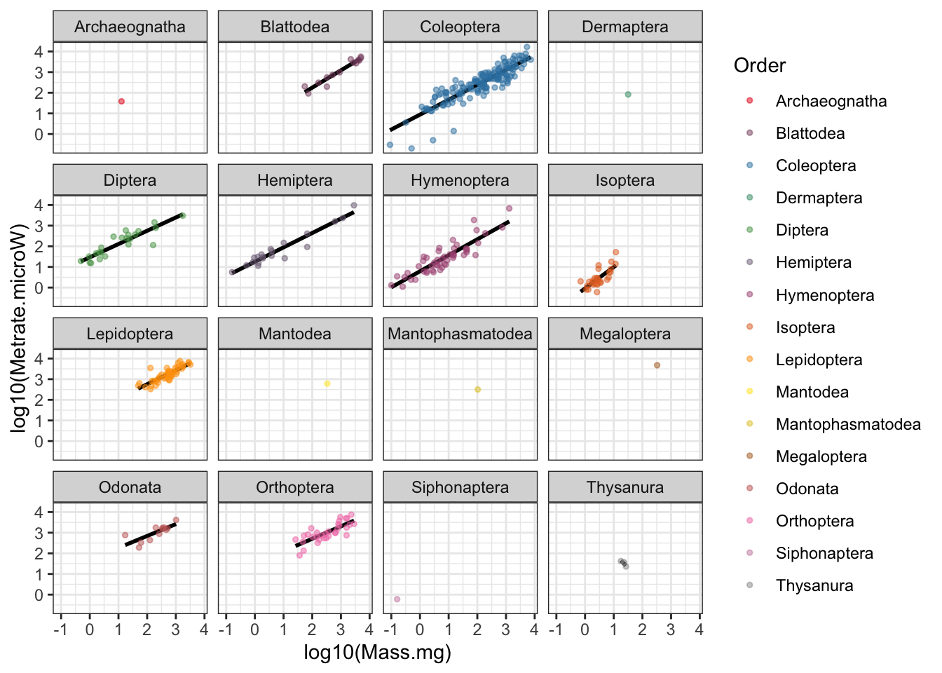
Figure 5: Insect metabolic allometry faceted by Order
Interactive plotting with plotly
The above graphs are fine, but don’t you ever find yourself wanting to know more about a single point? It turns out the spreadsheet we’re pulling these data from has that information, but we don’t plot it because it would be unsightly. Using the plotly library however, we can make an interactive plot of the data and specify text to be shown when you use your mouse to hover over the data. Note this doesn’t always work so great on mobile devices (where you can theoretically tap on a point for that hover-over info).
# Interactive plot of the allometry
# Goal: let viewer learn identity of each point
allometry.figure <-
  ggplot(chown, aes(x=log10(Mass.mg), y=log10(Metrate.microW), col=Order, group=Order)) +
  stat_smooth(method="lm", se=F) +
  geom_point(size=1, aes(text=Species)) +
  scale_color_manual(values=pal.1) +
  theme_bw()
## Warning: Ignoring unknown aesthetics: text

ggplotly(hide_legend(allometry.figure))
## `geom_smooth()` using formula 'y ~ x'
Figure 6: Plotly interactive figure; hover to see point information
When I tested this out, even though the plotly figure is being embedded on this R markdown html page, it looked like there were some large buttons obscuring a bunch of the points.
To see the plot in a separate window, it is also available to browse on the plotly chart studio site:
https://chart-studio.plotly.com/~lovetheants/5/#/
A few more iterations of this plot
Using the ggpubr library I was able to add the equation for the line. The ggplot2 package also has the ability to show the log-transformed axes with slightly more clear annotation labels and tick marks.
# Adding a little extra white space on top for clarity
# Simplifying to only a single (white) regression line
# Adding the equation (ggpubr library: https://rpkgs.datanovia.com/ggpubr/)
# Cleaning up the axis labels

# Static version (with equation!)
ggplot(chown, aes(x=log10(Mass.mg), y=log10(Metrate.microW))) +
  stat_smooth(aes(group=1), method="lm", se=T, col="white") +
  geom_point(size=1, aes(text=Species, col=Order)) +
  scale_color_manual(values=pal.1) +
  stat_cor(label.x = 0, label.y = 4.0) +
  stat_regline_equation(label.x = 0, label.y = 4.5) +
  labs(title="Insect metabolic allometry", subtitle="Data sourced from Chown et al., 2007", caption="Note log transformed axes.") +
  scale_x_continuous(name = "Mass (mg)", labels = scales::math_format(10^.x)) +
  scale_y_continuous(name = "Metabolic rate (µW)", labels = scales::math_format(10^.x), lim=c(-1,5)) +
  annotation_logticks() +
  theme_bw() +
  theme(panel.grid.minor = element_blank())
## Warning: Ignoring unknown aesthetics: text
## `geom_smooth()` using formula 'y ~ x'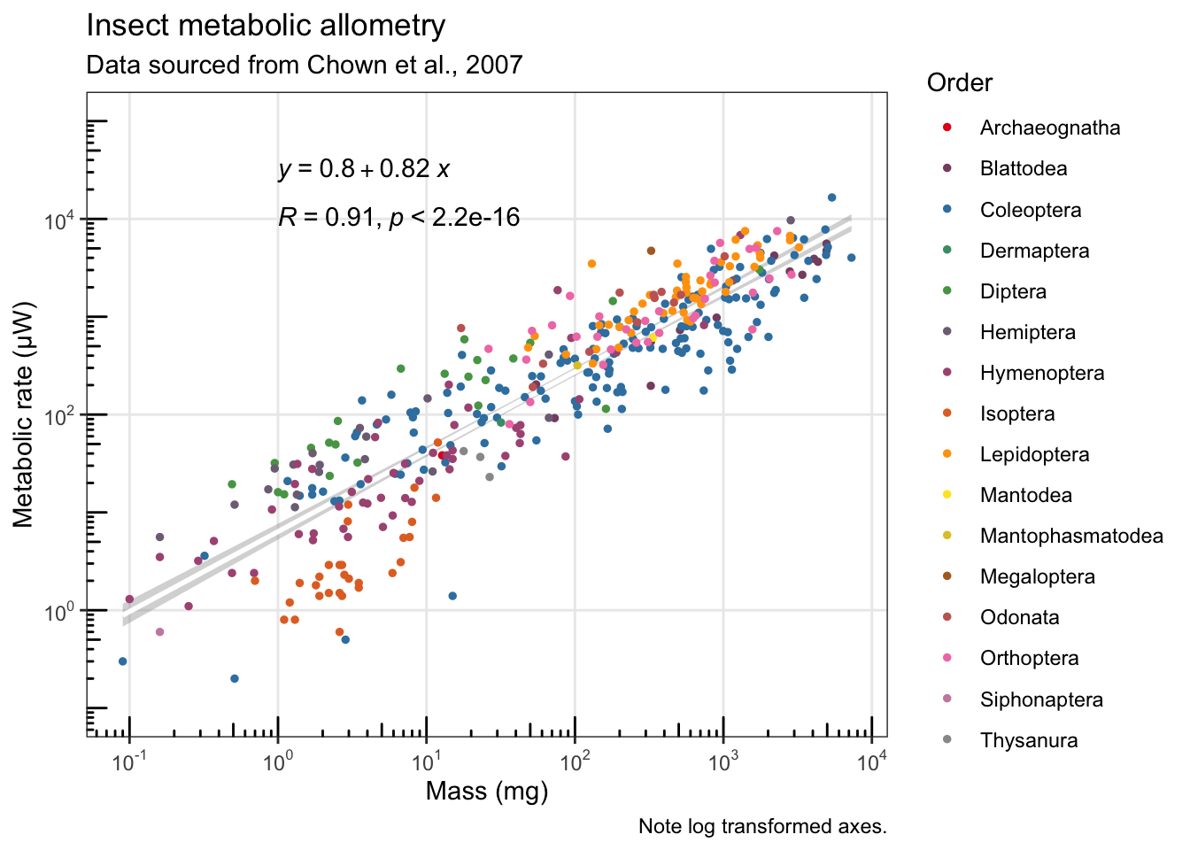
Unfortunately, a bunch of the formatting I tried to include in the previous graph wasn’t showing up well in the plotly version, so I paired it down a little, and also had to use a workaround to pass the ggplot2 title and caption to the plotly figure:
# Simplifying for the dynamic/interactive version
allometry.figure.2 <-
  ggplot(chown, aes(x=log10(Mass.mg), y=log10(Metrate.microW))) +
  stat_smooth(aes(group=1), method="lm", se=T, col="white") +
  geom_point(size=1, aes(text=Species, col=Order)) +
  scale_color_manual(values=pal.1) +
  labs(title="Insect metabolic allometry \n  Data sourced from Chown et al., 2007") +
  ylim(c(-1,5)) +
  theme_bw()
## Warning: Ignoring unknown aesthetics: text

# Needed to tweak how it plots the title/subtitle
ggplotly(allometry.figure.2) %>%
  layout(title = list(text = paste0('Insect metabolic allometry',
    '<br>',
    '<sup>',
    'Data sourced from Chown et al., 2007',
    '</sup>')))
## `geom_smooth()` using formula 'y ~ x'
In the interactive graph above, I had to remove a bunch of the extra formatting from the previous static figure because the features weren’t supported in plotly (equation, stats, log-tick annotated axes, subtitle, and caption).
What I do really like about the plotly figure with the legend included is the option to double click on one of the insect orders in the legend and isolate just those points. And you can do more than one at a time too. Play with it!
The plotly above is also available here: https://chart-studio.plotly.com/~lovetheants/9
Thanks again to Steven Chown and colleagues for compiling the source data all of this is based on.
Chown, S.L., Marais, E., Terblanche, J.S., Klok, C.J., Lighton, J.R.B. and Blackburn, T.M., 2007. Scaling of insect metabolic rate is inconsistent with the nutrient supply network model. Functional Ecology, 21(2), pp.282-290. https://besjournals.onlinelibrary.wiley.com/doi/10.1111/j.1365-2435.2007.01245.x